
SWAP BRAND IDENTITY
I created a brand identity for a event series that raises money for initiatives like Operation Olive Branch and SAPA by hosting clothing and art swaps in New York City. The target demographic attending the swaps is Gen Z twenty-somethings who want to reduce clothing waste, donate to causes they believe in, and meet like-minded people.
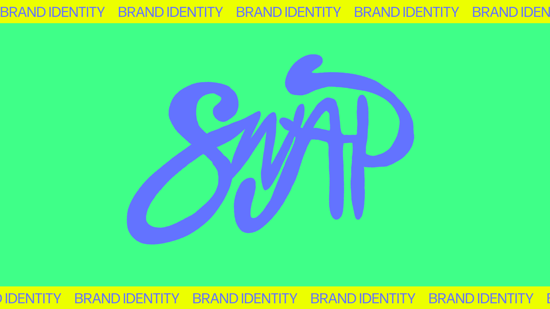
With this in mind, I hand-drew a logo with swashes and intersecting parts to represent the community aspect of the organization. I chose a set of six bright, digital-first colors to be eye-catching and capable of many unexpected combinations.

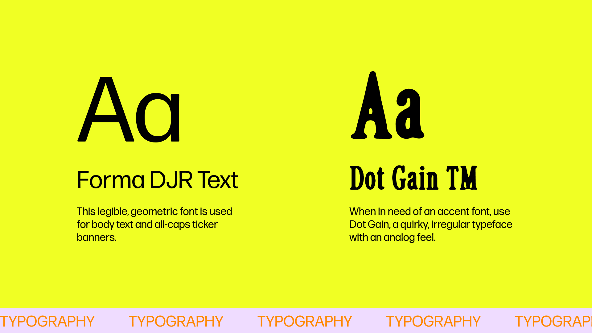
For fonts, I wanted to build a typographic set that could easily and organically accommodate the hand-drawn logo and text call-outs, something that would look intentionally mismatched and just the right amount of chaotic without coming off as discordant. Forma DJR Text, indeed the text used on this very website, was a good basic font for the body text, while Dot Gain has that ink blot, physical feel that I think blurs the line nicely from straight-laced Forma to the naive-style text call-outs (visible on the membership card and social examples).
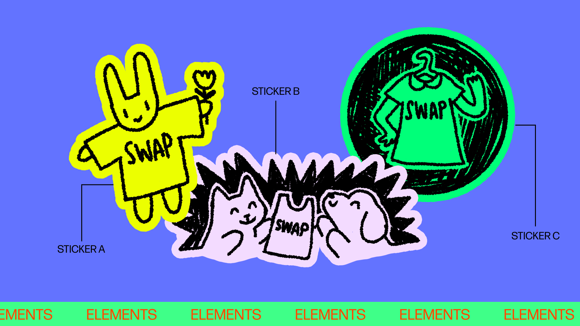
Now here’s the fun part—application! I drew these three doodles to use as sticker elements to accent the hand-drawn aspects of the brand. I used cute, simplistic animals as an homage to cartoon characters beloved by Gen Z such as Miffy and Snoopy.
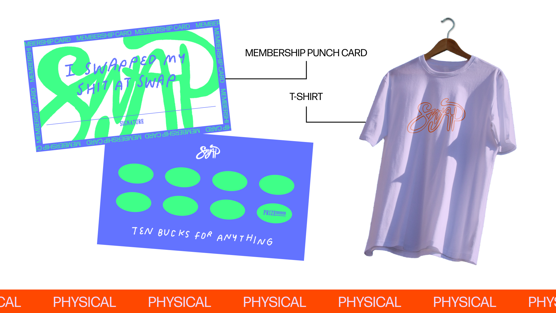
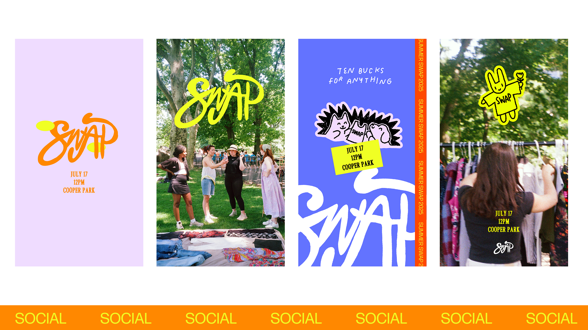
Finally, the physical and social applications show how the brand comes to life in the real and digital worlds. The high-contrast, adventurous color combinations look nice over film photos I took of one event as seen in the IG Story examples, and of course an event series must have a punch card.